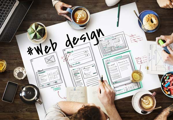
Your website is your number one marketing tool, and it is a premium opportunity to communicate all your small business offerings.
When visitors come to your website, they’ll sum it up in a flash based on what they see. Content is important, but aesthetics are a close second.
Whether you’re designing your own website or hiring someone to design one for you, you should have a solid idea of how you want to portray your business. If you have already started establishing your identity with a logo and a marketing plan, then you’ve got the foundation you need for your small business website design.
However, there are still many considerations to keep in mind, and throughout the process of designing a new website (or redesigning an existing one), you will need to make choices about how your site will look and feel so that it represents your business accurately.
Small Business Website Design Tips
Here are some small business website design tips that cover the core components every website needs in order to succeed. These tips will help you make smart design choices so that your site captures visitors’ attention while maintaining the integrity of your company’s identity.
1. Build Your Brand with a Logo
Your small business website design is an excellent tool for brand building. If you have a logo, it should be prominently displayed in your website’s header. The header is a strip across the top of a website, which usually includes the logo and a menu. It appears on all pages, which means your logo is displayed on every page. If you don’t have a logo, you should get one immediately. If you’re an independent entrepreneur using your name to do business, consider developing a signature-style logo, using a particular font and possibly your photo or some other simple visual emblem. Logos help to build familiarity, association, and reputation, and they are essential in developing your business’s identity. Bonus tip: make sure your logo is clickable and takes visitors to the home page.
2. Make Thoughtful Color Choices
Often the color choices you’ve made for your logo will drive the design of your website. However, simple logos or brand designs that are flexible enough to adapt to a broader color scheme may lend themselves to a wider variety of choices. You should already know the objective of your site, so choose colors accordingly. If you want visitors to feel calm and relaxed, go with cool colors (blues and lavenders). If you want them to feel energized or passionate, go for warm colors (reds and oranges).
There are an unlimited number of color combinations available; a good way to determine what direction you want to take is to spend some time surfing around the web looking at sites that target the same audience you are going after, and make note of designs that strike your fancy. Keep in mind that selecting two or three different colors in varying shades will generate a better design.
3. Typography
There are so many exciting fonts out there, but don’t be tempted! You can use fancy fonts for your title, logo, and headings, but use a very simple, easy-to-read font for the bulk of your content, and remember that fonts are stored on visitors’ computers locally, so if you’re using a font that’s not web-friendly, you’ll have to turn it into an image or make sure it’s installed on your web server. For long passages of text, make sure you use dark text on a light background for better readability. Too many people get overly excited about all the font and color choices and go to great lengths to make their small business website design look extraordinary with typography, but if you make the text difficult to read, visitors will click off to some other website that puts less stress on their eyesight. Lastly, make sure your font size is not too small…or too big.
4. Images
The more images you have on any web page, the longer it takes to load. Generally, web surfers will wait just a few short seconds for a page to load before they go off in search of speedier delivery. Make sure your images are optimized for web publishing and don’t clutter your page with them. Keep in mind that videos and slideshows take even longer to load than regular images. However, you should have at least one image on each page; longer pages should feature multiple images or graphics. Images break up long passages of text and create visual interest, which is attractive to the eye. Of course sites geared toward art, photography, film, etc. are exceptions to this rule! They should be loaded with images!
5. Layout & Content Planning
Before you design your small business website, you should have a good idea of what its content will be. This is achieved through thoughtful web content planning and development. Once you have a plan, you or your designer can start to establish a layout and small business website design that is built to hold your content. There’s nothing worse than putting a site together only to discover there’s not enough room in your navigation menu for all the content you want to include.
6. Navigation
Your main menu or navigation bar will act as your site’s table of contents. It is here that you want to display simple links to key pages within your site. There are a few pillar pages that almost every website should have, which include home, about, and contact. Most business sites will also include products or services pages. Take a look at other sites within your industry to determine which other key pages warrant a link on the navigation menu. This menu should be clearly labeled, easy to find, and should appear in the same spot on all pages across the site. This makes your website more user friendly. If you want to display more pages than your menu will hold, then you’ll use drop-down menus: for example, when a user hovers over the Products link in your menu, a list of your product categories appears as a drop-down.
7. Language
Make sure the language on your website is easy to read and don’t stuff it with industry jargon. Anybody who lands on your site should be able to immediately figure out what you offer. This is often especially problematic in the tech sector. Tech websites often present blurbs and passages of text that are meaningless to a layperson. Make sure the tone of the writing is aligned with the attitude you want to project (friendly, professional, edgy, etc.). Web design is visual, so you’ll also need to make sure it looks good to the eye. That means longer paragraphs are interspersed with shorter paragraphs and lengthy pages are broken up with subheadings and images. Make sure every page has a clear title and introduction so visitors know what it’s about.
Moving Forward
Small business website design projects can be stressful but can also be a lot of fun. It’s exciting to see the whole thing come together, especially for the first time. Redesigns will breathe new life into a business and will often ramp up sales, even in a down economy.
A few final small business website design tips:
- Keep your design flexible enough so that you can add and change content later.
- Include a plan for website maintenance and regular updates. If your budget allows, consider hiring a website manager.
- Make sure the site is thoroughly tested on various devices (screen sizes) and browsers to ensure full functionality.
- If you use forms on your website, test them before launch and then schedule quarterly or annual tests to make sure they’re still working.
- Plan regular audits to review your website and assess whether the design or content needs to be updated.
Buzz Pro Studio provides website services to small businesses and independent professionals, specializing in website design and maintenance. For more information or to get a no-obligation quote, contact me.
Melissa Donovan is the founder of Buzz Pro Studio, providing website services to small businesses and independent professionals.


All I can say is, thank heaven for WordPress. I can’t design a website from scratch, but I know what needs to be there, and they make it easy!
Great post, Melissa!
I used to design websites from scratch (hand-typed HTML), then I used Photoshop for awhile. I could never get along with FrontPage (or any WYSIWYG editor). But WordPress is heaven sent! I absolutely love it – both from a design perspective and for its usability. My favorite thing about it is how easy it is to make updates. It’s ideal for business owners, because they can hire a designer to create a website one time, and then take care of all their own updates. Super sweet!
Nice tips on website design, Melissa. I love this site. It’s so creative and fun! You go, girl!!!!
I agree with Deb: thank heaven for WordPress! 🙂
*smiles*
Michele
Thanks Michele! I’m grateful for WordPress and the way it’s changed design. Before content management systems became so accessible, I never would have attempted a site with a lot of content (how to keep track of hundreds of pages?). With WordPress, it’s a breeze, but you already know that 😉
How important you’d say it is to keep header clickable if you have “Home” button in navigation?
I suppose it’s less important, but it’s become so standard, that it might seem like things aren’t working correctly if the logo isn’t clickable and linked to the home page. Good question!